Custom Column Selection on a Vue Datagrid
Custom Column Selection on a Vue Datagrid
On the application I’m building, I wanted users to be able to select which columns they see. Staring at a screen full of data can be headache inducing — especially when trying to parse between what columns are what. When things get bloated, it can be confusing to see ‘customer_id’ and ‘id’ on the same table where you’re trying to find the ‘referral_source’ column. Intercom does this really well.
I started off with the Vue datagrid component from the vue documentation as a template for my datagrid.
Because I’m using it as a single file component, I had to seperate out the query function and the actual table part into seperate components. The parent is datagrid.vue while the child is datatable.vue. This way, datagrid can pass it’s query string to datatable
Plus, it keeps the actual table part and all of it’s niceties like the columns selector and search fields apart from one another.
My models
In this table I have a grid of items. An item object contains a number of parameters like id, name, description, created_at, updated_at, team_id, user_id, board_id, and lots of others. This data takes the form of an array of objects.
My Vue setup
I have vue and vuex setup in my rails 6 application. I won’t go over how to do this, as the documentation can do a better job at explaining the setup process than I can.
In addition, I also have a store setup so I can easily get and set data from the backend of things.
The files this feature touches:
app/javascript/packs/application.js
app/javascript/components/datagrid.vue
app/javascript/components/datatable.vue
app/views/dashboards/index.html.erb
app/controllers/dashboards_controller.rb
One note: don’t forget to include your javascript pack tag wherever you may keep them. Mine is in my application layout file like so: <%= javascript_pack_tag 'application', 'data-turbolinks-track': 'reload' %>
Anyways, on to the code…
Application.js
Register the datagrid component with Vue
Alongside any imports, add import Datagrid from '../components/datagrid'.
Within your store, add a place to store your items (or whatever name it is you’ll be using)
` window.store = new Vuex.Store({ state: { items: [], }, `
We’ll then setup Vue to listen for our datagrid element:
document.addEventListener("turbolinks:load", function() {
    var element = document.querySelector("#datagrid")
        if (element != undefined) {
            window.store.state.items = JSON.parse(element.dataset.items)
            const datagrid = new Vue({
            el: element,
            store: window.store,
            template: "<Datagrid />",
            components: { Datagrid }    })
        }
    })
Our view & view controller
Now we need to add a #datagrid to a view somewhere so the query selector in the code above can do it’s thang.
I have mine in my views/dashboards.index.html.erb but you can put yours wherever you need to render your datagrid.
` <%= tag.div id: :datagrid, data: { items: @items.to_json } %> `
Obv, our app needs to know what @items and columnsArray means because it’s a computer and it’s pretty stupid unless you tell it explicity what to do (ok, maybe minus machine learning but I digress…).
So we find the items we want in our view’s controller (mine is in the index, but yours may be somewhere else):
def index
    @items = Item.where('team_id = ?', current_user.team_id)
end
If you want to check out what kind of data you’re spitting out, throw a couple of console.logs into the datagrid setup in application.js (hint: try console.log(window.sotre.state.items)).
datagrid.vue
Now for the fun Vue stuff! We have our datagrid div id setup and all prepped and ready to do something with some data.
Let’s set up datagrid.vue, i.e the parent controller in this relationship.
The <template> section
There are three major chunks to the template section of this code.
- the search query area
- the column selection dropdown
- the datatable child component
The search query area has an input boxed named “query” and a v-model=”searchQuery” we’ll send to the datatable as a prop in just a bit.
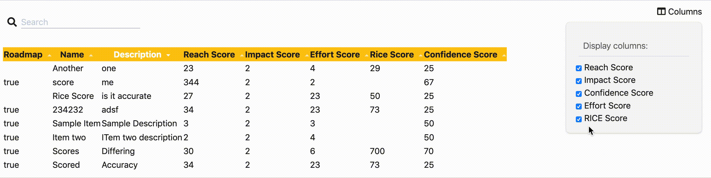
The next part is the dropdown menu for column selection. We show and hide it on click using v-on:click="visible =!visible". When visible, we’ll see a list of checkboxes that track our selections in v-model="checkedColumns".
Finally, we have the datatable child component. We use this div to send the columns the user has selected via :columns="checkedColumns" and the text from the input field with :filter="searchQuery".
<template>
  <div id="datagrid">
    <div class="flex flex-row flex-no-wrap justify-between">

    <!-- left items -->
      <div class="flex flex-row m-2 justify-start items-center">
        <div class="text-lg font-light pr-2">
          <i class="fas fa-search"></i>
        </div>
        <div class="border-b border-solid border-neutral-6 w-56">
          <input name="query" v-model="searchQuery" placeholder="Search">
        </div>
      </div>

      <!-- Right items -->
      <div class="flex flex-row m-2 justify-start items-center">
        <div v-on:click="visible = !visible" class="mb-10 hover:cursor-pointer"><i class="fas fa-columns"></i>
         Columns
        </div>
        <div class="relative">
          <div v-if="visible" class="w-64 bg-neutral-1 p-4 absolute right-0 top-0 rounded-lg shadow border border-neutral-2">
            <div class="text-md font-light text-neutral-7 border-b border-neutral-3 m-2 p-2">Display columns:
            </div>
            <div>
              <input type="checkbox" id="reach_score" value="reach_score" v-model="checkedColumns">
              <label for="reach_score">Reach Score</label>
            </div>
            <div>
              <input type="checkbox" id="impact_score" value="impact_score" v-model="checkedColumns">
              <label for="impact_score">Impact Score</label>
            </div>
            <div>
              <input type="checkbox" id="confidence_score" value="confidence_score" v-model="checkedColumns">
              <label for="confidence_score">Confidence Score</label>
            </div>
            <div>
              <input type="checkbox" id="effort_score" value="effort_score" v-model="checkedColumns">
              <label for="effort_score">Effort Score</label>
            </div>
            <div>
              <input type="checkbox" id="rice_score" value="rice_score" v-model="checkedColumns">
              <label for="rice_score">RICE Score</label>
            </div>
          </div>
        </div>
      </div>
    </div>

    <div class="mt-2">
      <datatable :columns="checkedColumns" :filter="searchQuery"></datatable>
    </div>

  </div>
</template>
The <script> section
In the script section we need to import our child component so vue knows what to do with the <datatable> element we’ve given it. We also need to register it as a component.
In checkedColumns, I’ve added the columns I want to be the default columns.
<script>

    import datatable from "./datatable.vue";

    export default {
        components: { datatable },
        data: function() {
        return {
            searchQuery: '',
            visible: false,
            checkedColumns: ["roadmap", "name", "description", "reach_score", "impact_score", "confidence_score", "effort_score", "rice_score"],
        }
    },
}
</script>
Datatable.vue
Last but not least, we have datatable.vue. This accepts the filter and columns prop from the parent component, filters based on query, sorts based on column clicked on, and makes the formatting a bit prettier. My data included a lot of underscored names, so you may want to edit or remove the removeUnderscoreCapitalize filter as you see fit.
<template>
  <div>
    <table>
      <thead>
        <tr>
          <th v-for="key in columns"  @click="sortBy(key)"
            :class="{ active: sortKey == key }" class="bg-yellow-5">

            <span class="arrow" :class="sortOrders[key] > 0 ? 'asc' : 'dsc'">
            </span>
          </th>
        </tr>
      </thead>
      <tbody>
        <tr v-for="item in filteredItems">
          <td v-for="key in columns">

          </td>
        </tr>
      </tbody>
    </table>
  </div>
</template>

<script>
  export default {
    props: [
      "filter",
      "columns"
    ],
    data: function() {
      var sortOrders = {}
      this.columns.forEach(function (key) {
        sortOrders[key] = 1
      })
      return {
        searchQuery: '',
        sortKey: '',
        sortOrders: sortOrders,
      }
    },

    computed: {
      items: {
        get() {
          return this.$store.state.items
        },
        set(value) {
          this.$store.state.items = value
        },
      },
      filteredItems: function () {
        var sortKey = this.sortKey
        var filter = this.filter && this.filter.toLowerCase()
        var order = this.sortOrders[sortKey] || 1
        var items = this.items
        if (filter) {
          items = items.filter(function (row) {
            return Object.keys(row).some(function (key) {
              return String(row[key]).toLowerCase().indexOf(filter) > -1
            })
          })
        }
        if (sortKey) {
          items = items.slice().sort(function (a, b) {
            a = a[sortKey]
            b = b[sortKey]
            return (a === b ? 0 : a > b ? 1 : -1) * order
          })
        }
        return items
      }

    },

    filters: {
      removeUnderscoreCapitalize: function (str) {
        var res = str.replace("_", " ");
        // return res.charAt(0).toUpperCase() + res.slice(1);
        return res.replace(/\w\S*/g, function(txt){
          return txt.charAt(0).toUpperCase() + txt.substr(1).toLowerCase();
        });
      },
  },

    methods: {
      sortBy: function (key) {
        console.log("SortBy Called")
        this.sortKey = key
        console.log(this.sortKey)
        this.sortOrders[key] = this.sortOrders[key] * -1
        console.log(this.sortOrders[key])
    }
  }


  }
</script>

<style scoped>

th {
  cursor: pointer;
  -webkit-user-select: none;
  -moz-user-select: none;
  -ms-user-select: none;
  user-select: none;
}

th.active {
  color: #fff;
}

th.active .arrow {
  opacity: 1;
}

.arrow {
  display: inline-block;
  vertical-align: middle;
  width: 0;
  height: 0;
  margin-left: 5px;
  opacity: 0.66;
}

.arrow.asc {
  border-left: 4px solid transparent;
  border-right: 4px solid transparent;
  border-bottom: 4px solid #fff;
}

.arrow.dsc {
  border-left: 4px solid transparent;
  border-right: 4px solid transparent;
  border-top: 4px solid #fff;
}
</style>